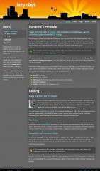
Dynamic Template
Taken from the book of fluidity, this template is exceptionally easy to customize using re-useable CSS classes.
This template quickly and easily allows for one, two, three or even four column layouts. This is done with simple CSS classes that can be used over and over again. To learn more about it, follow this link. The template itself is valid XTHML 1.0 strict and almost valid CSS. The almost is added in there because CSS expressions were used. You can read more about that here.
This template doesn't use fixed columns. With a few simple CSS classes you can quickly change the appearance. Click here to learn how.
Since this template is fluid width and the font sizes are defined relatively, you can change font size without breaking the layout. The fluid width also means that people with higher resolutions aren't constrained.
Total size of the images used is just under 25 kb, so that's good news to all the dial-up users. The code behind the template is semantically written which means that it is widely supported. As for the browsers, it displays consistently in the usual suspects:
- Firefox of course
- Opera sure, why not
- Netscape like firefox's less attractive cousin at the dance
- Internet Explorer ...
- Safari cause macs are computers too
Coding
Image Alignment and The Header
Images are fully supported using the floatLeft and floatRight classes. Just apply one of them to the image you want to position. Images that have link tags around them will also have a nifty rollover effect, as long as you're using a standards complients browser. If you're not, well then no rollover effect for you.
The site header images are two slices and a repeated background. Using the same approach, and a little bit of photoshop, you should be able to easily replace them. However, since they were created by me, you're welcome to use them in any projects you might like.
The Footer
A variation on the footerStickAlt technique is used to force the site footer to the bottom of the page if there isn't enough content to push it down. This means your template will always look tidy and you won't have to worry about a lonely footer, hanging out halfway up your page.
Readability using Maximum Width
To improve readability of this template (since it is fluid), the width is capped at 1000 pixels. This seems like a pretty reasonable thing to do and that's why CSS has thoughtfully included the max-width property. Unfortunately, IE decided it didn't need no stinkin' max-width, so a CSS expression was needed.
A CSS expression is like a snippet of javascript code that runs in your style sheet. It's invalid CSS, but only IE pays any attention to it.
If you're concerned about having valid CSS, take out the expression. It won't ruin the template in IE, it just means that the content will expand to 100% of the screen width. All other browsers will behave.
 (0)
(0) (0)
(0)
