Date added: 2006-02-22 | Hits: 379 | Rating:

(2)
Added by:
Themebot HTML Templates 2 Columns Fixed Width CSS-Based Layout
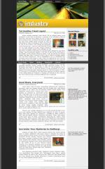
Here's another centered, fixed layout. All my designs seem to be variations on this kind of structure; I promise I'll do something different next time. This one has a floaty nav bar on top for quick access to links, as well as the top of the page. I can see some people being annoyed by this, so fortunately it's easy to change so that it doesn't stay on top of the window. Just change the position: fixed to position: absolute and ditch the IE hack (or you could change it to auto margins instead, if you want the header image to flow beneath it). One thing that I included in this layout is a couple handy classes for your Flickr images. See the example pullouts in the text as well as the thumbnails in the sidebar. In the interest of filling up space, I may as well tell you that the sidebar has been done in kind of a funny way to make it vertically stretch over the entire content div. This is impossible to do in a traditional way (including using 100% height in CSS, which isn't defined the way it should be). Check it out; I thought I was pretty clever to think of it! You could use the sidebar for annotations, footnotes, links, photos, or whatever you like.
 (2)
(2) (2)
(2)
