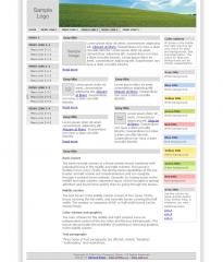
Basic layout
The basic concept consiss of a three-column layout combined with individual boxes in the middle and right columns. The layout is flexible in two ways. Firstly, the strong menu-capabilities at the top header and left column are comphrehensive and can navigate through a content heavy website. Secondly, by having boxes in the middle and right columns, important topics can be brought to special attention and found more quickly than by going through the menus.
Middle section
The text boxes in the middle column consist of two types. Firstly, boxes covering the full width, and secondly boxes covering the half width. The number or sequence of full- or half-width boxes can be chosen freely.
Color scheme and graphics
The color scheme for the middle and right columns have an independent control of the box titles and the box backgrounds. The layout also provides the possibility of inserting or removing graphics in the middle column.
Text paragraphs
Three types of text paragraphs are offered, namely "heading", "subheading" and normal text.
 (0)
(0) (0)
(0)
