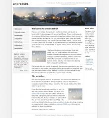
This is a very simple (but also very useful) standard web layout: a fixed-width 3-column page with header and footer. There are thousands of variations of this layout, and this is no perfect solution. But it should be a great starting layout that you can customize in many ways and easily give a unique touch to. The layout is made of valid XHTML 1.0 Strict and CSS only, and it has no tables. If you remove all CSS, the page still works great in text mode (I've tested it on my old mobile phone, and it works like a charm).
The layout features one big image (front.jpg) which you can easily replace with your own header. The default image shows a snowy street in Porjus (northern Sweden), where I come from. The haiku can easily be replaced with an ad banner. There are also CSS classes for aligning text paragraphs and images.
This layout also has a print stylesheet, that you can customize in any way you want to. Per default, navigation menus and images are removed, and only the main content text is printed. Look here for an example of how the print layout looks, or print this page to see it in reality.
The menubar
The main navigation menu is an unsorted list, where each list item has been styled to be a button. There are lots of ways to style lists for navigation, but I've kept things simple for this layout. Adding "that little extra" is up to you!
If you like this layout and would like to use it in any way, you are free to do so. This is an open source web design, and all I ask for is that you leave the "Design by Andreas Viklund" link in the footer of the site. If you would like to remove that line, or if you would like professional help with anything related to this layout (such as custom design, branding, scripting or programming), please contact me through OSWD.org or through my website for more information.
Good luck with your new website!
 (2)
(2) (2)
(2)

