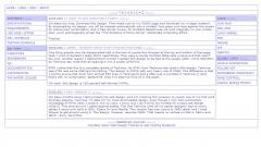
It's been too long. Download this design. Then head over to my OSWD page and download my vintage material. By downloading my design, you will be entered automatically into a contest! Just press your face against the screen for retinal scan confirmation, and a free dinner coupon for Outback Steakhouse will print magically on your printer. Also, you'll automagically joined the "Find Evidence of Penny Brown" distributed computing effort.
One thing people may be disappointed with is the lack of purple box thingies at the top and bottom of the page. Well, I kind of decided I really didn't need those. They were a couple hundred table cells a piece and that wasn't too cool. Another reason I ditched them is that I wanted this design to be tied to the screen width, not to 800x600, as Technica was. Note that all spacing is now 3 pixels uniformly.
BTW, notice that this is a complete rewrite of Technica. No HTML from Technica was used in this design. Technica was HTML was some CSS text formatting. This design is XHTML with very heavy use of CSS2. The difference is that I cut the source size down from almost 650 lines in Technica to just a little over a hundred in Technica ][ (and that's with no combination 'table/tr/td' lines I've been so fond of in the past).
Oh yeah, this design is 100-percent well-formed XHTML. Thanks!
It's been months since I last jumped into web design, and I'm marking this occasion to rework one of my first (and favorite) designs, Technica. To date it's my most-downloaded design, even though I only had rudimentary knowledge of HTML when I wrote it. It's no Libra, I know, but I don't think it's horrible for a total web design n00b13. This time around I opted against tables. The first Technica (and all my earlier designs) had so many tables it would only work in IE5+, Opera 5+ and Mozilla. This version has one (count it, ONE) table, and I tried forever to get around using it. This design, however, requires CSS2. That means no workee on NS4.x, NS6.x and IE5.5-. Sorry 'bout that.
 (0)
(0) (0)
(0)
