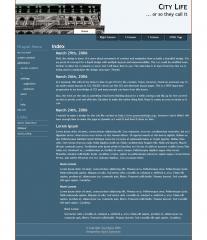
Well, the design is done. It is more about movement of content and navigation than actually a beautiful design. It is my proof-of-concept for a liquid design with multiple layouts and maneuverability. The css could be modified even further to allow for 4 columns or more, but I will leave that to you. The main idea is to learn from how the css is being used to manipulate the design structure. Thanks!
As I assumed, this will not be done in time to get it in for the contest. I have, however, found an awesome way to do multi-column layouts in CSS. PLEASE check out the CSS and alternate layout pages. This is a VERY important progression in my knowledge of CSS and many people can learn from this lesson.
Also, the trick on the tabs is something I had been thinking about for a while, having a tab flip up for the current section is pretty cool and effective. Decided to make the entire thing fluid. Hope it comes accross as nicely as it can.
I wanted to make a design for the city life contest at http://www.openwebdesign.org/, however I don't think I will have enough time to make the page as dynamic as I want it and have it done on time.
 (0)
(0) (0)
(0)
