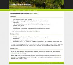
This template is a modified version of tristar’s original changes.
- Page hyperlinks are a bit easier to notice
- Made the green menu slightly darker so that the white links are easier to see
- Fluid design
- Code redone (not that I am saying mine is better, I just like coding my own way.)
- Gradients resize with font
- More user friendly
- Different banner to accomodate for the fluid layout (original wasn't wide enough)
To view the source of this banner, see picture 485493 at sxc.hu
design.notes
- 800x600 and up (Can stretch to 2000px wide without the banner running out)
- valid xhtml/css
- looks great! (not open to subjective dispute)
- Tested and ok in IE5.5, IE6, Firefox 1.51, Opera 8.53 (although IE5.5 has a small bug, but it still looks fine)
A problem with fluid designs is that once the content stretches wide, the line lengths become rather long, and are harder to read. Hopefully because the content on this is 75% wide, the line lengths do not become too wide.
please note: as this is a free template the only thing i ask in return is you leave the bottom link to tri-star web design as it is, anything else you can chop and change to your hearts content. thank you for downloading this template, i hope it comes in handy.
 (1)
(1) (1)
(1)
